By Sarah Eising, Pacific Environments Marketing and Graphics.
I’ve been thinking about colour a lot lately, especially colour in Architecture.
Maybe it’s because we’re moving into the warmer months and the grey haze of winter is lifting.
Maybe it’s because colour can influence your mood.
Maybe it’s because I have young kids, so I’m surrounded by their colourful activities.
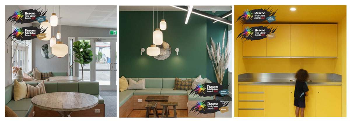
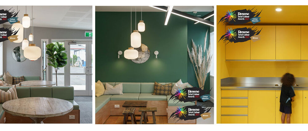
Or it could be because we’ve just picked up the Resene Colour Maestro Award with our recent work with Huapai District School.
Rachel our project Architect said “Its been a fun project to work on and explore my inner colour craziness. Great to have the paint colour company support me in any shades possible”.
When I think about the Pacific Environments team and our portfolio, you can see a pop of colour coming through in our work. Its quite fun.
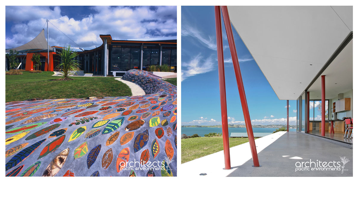
Just a quick flick through our portfolio pages, I pull out Massey Library and Leisure centre, a building that’s many years old now. And it may have been repainted, but in our completion photos it has a bright red-orange entrance way – drawing you in to the wonderful books inside.
Then we have Matakana House, with its beautiful white and concrete and light wood, has bright red structural poles both inside and outside. Our recently finished Ashton Road project has moody, deep colours in the living areas making them cosy, and the more open living areas are a soft white with artwork bringing in the colour.
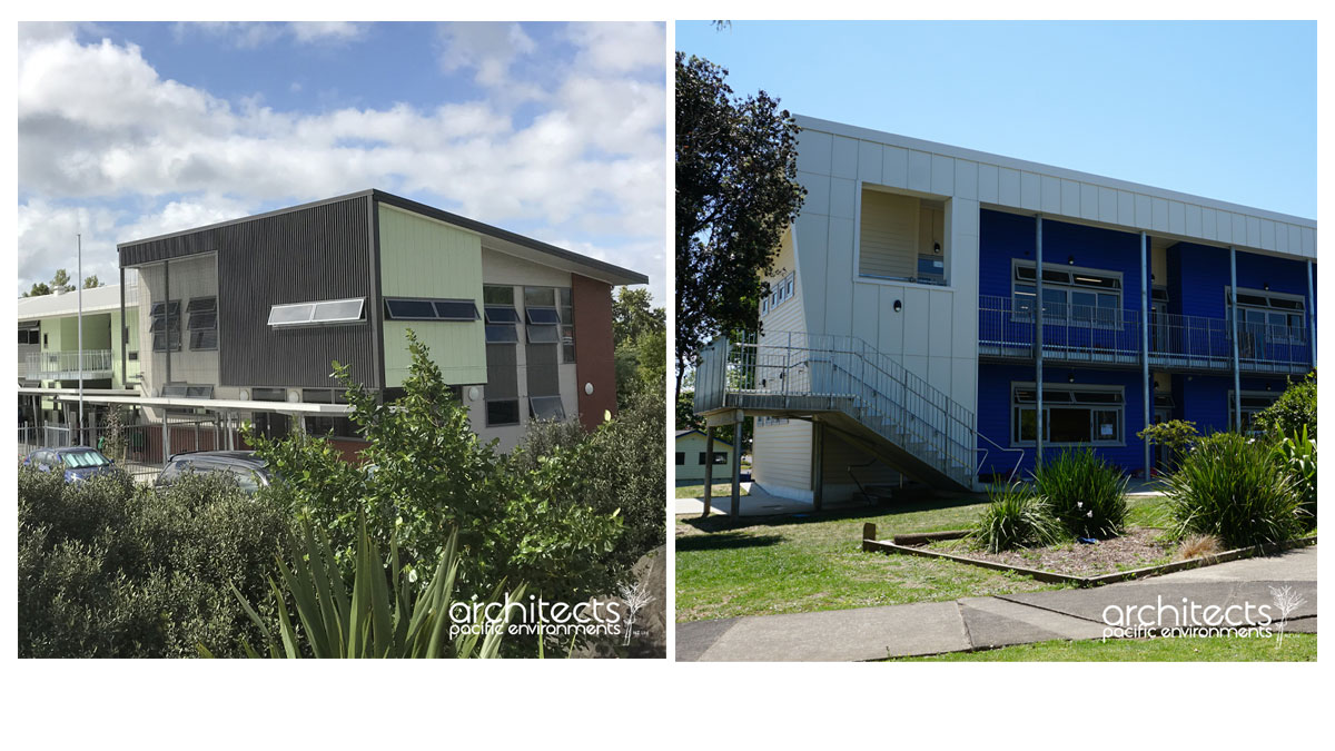
Many of our recent education projects have colour all over them, from subtle soft greens on Riverhead school, and royal blue and white on New Lynn School. Northern Health School has an interior fitout of lime green, orange and blue with natural woods and greys.
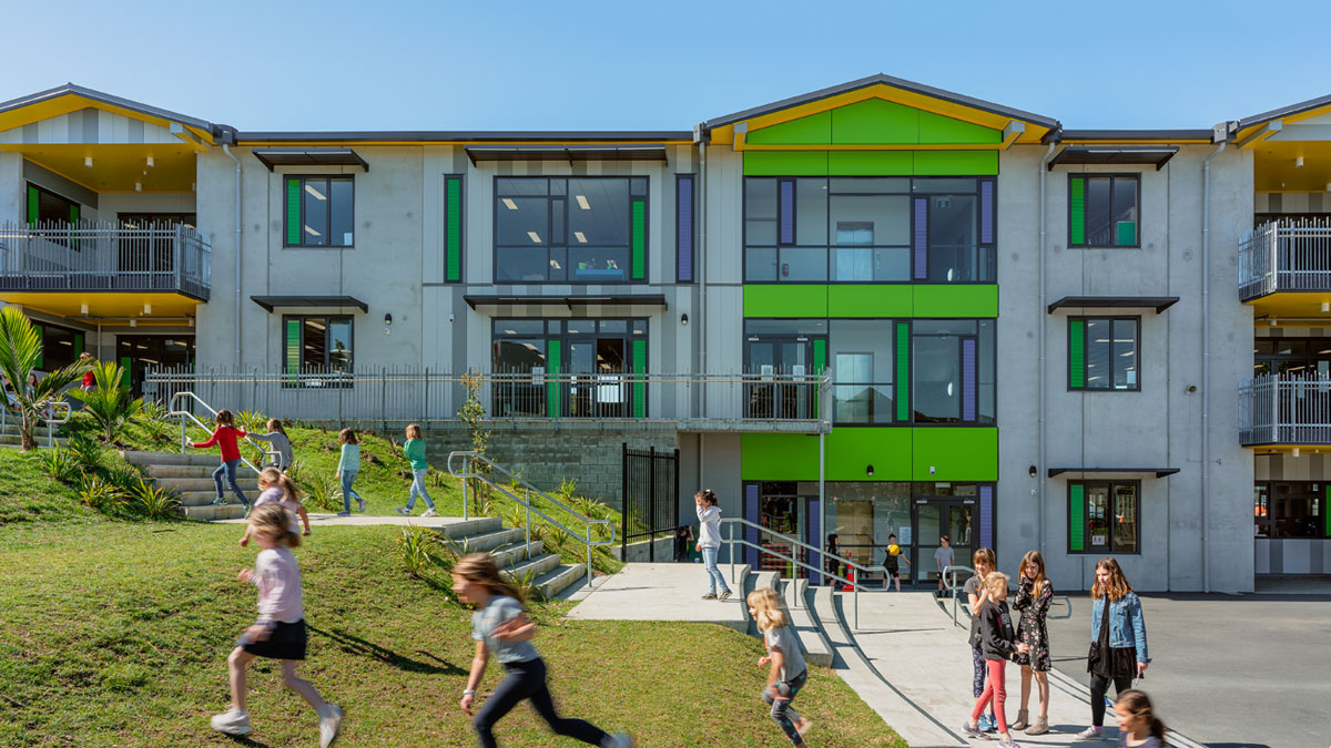
Grey Lynn School has its colour shining bright on the outside with lime, blue and yellow – I remember talking to Associate and Project Architect Caroline Farnan about the colour on this project and she said the yellow soffits were inspired by walking under her yellow umbrella and getting peeks of colour on a grey wet day.
And then we have (colour award winning) Huapai School with its soft moody greens and light interior, contrasted with a bright yellow kitchen!
Colour is pretty amazing. We are surrounded by it, and we all have different favourites and colours we feel comfortable around. It has a way to change your mood, make your feel certain ways, change your view on something (remember ‘the dress’?). There are colours we consider happy, and moody. Light colours can make a room feel bigger, or more sterile. Darker colours can make a space feel smaller, or cosier depending on your view.
Colour is all around us. It can be applied to us in the form of clothing, hair colour, tattoos. Colour can be applied to the environment around us in the décor and objects we buy, the colours we paint and fill our homes with, onto our physical building and in the landscaping around them.
Whats your favourite colour mix and style, and how have you used it in (or on) the place you live, work, learn or play?




Comments are closed.